
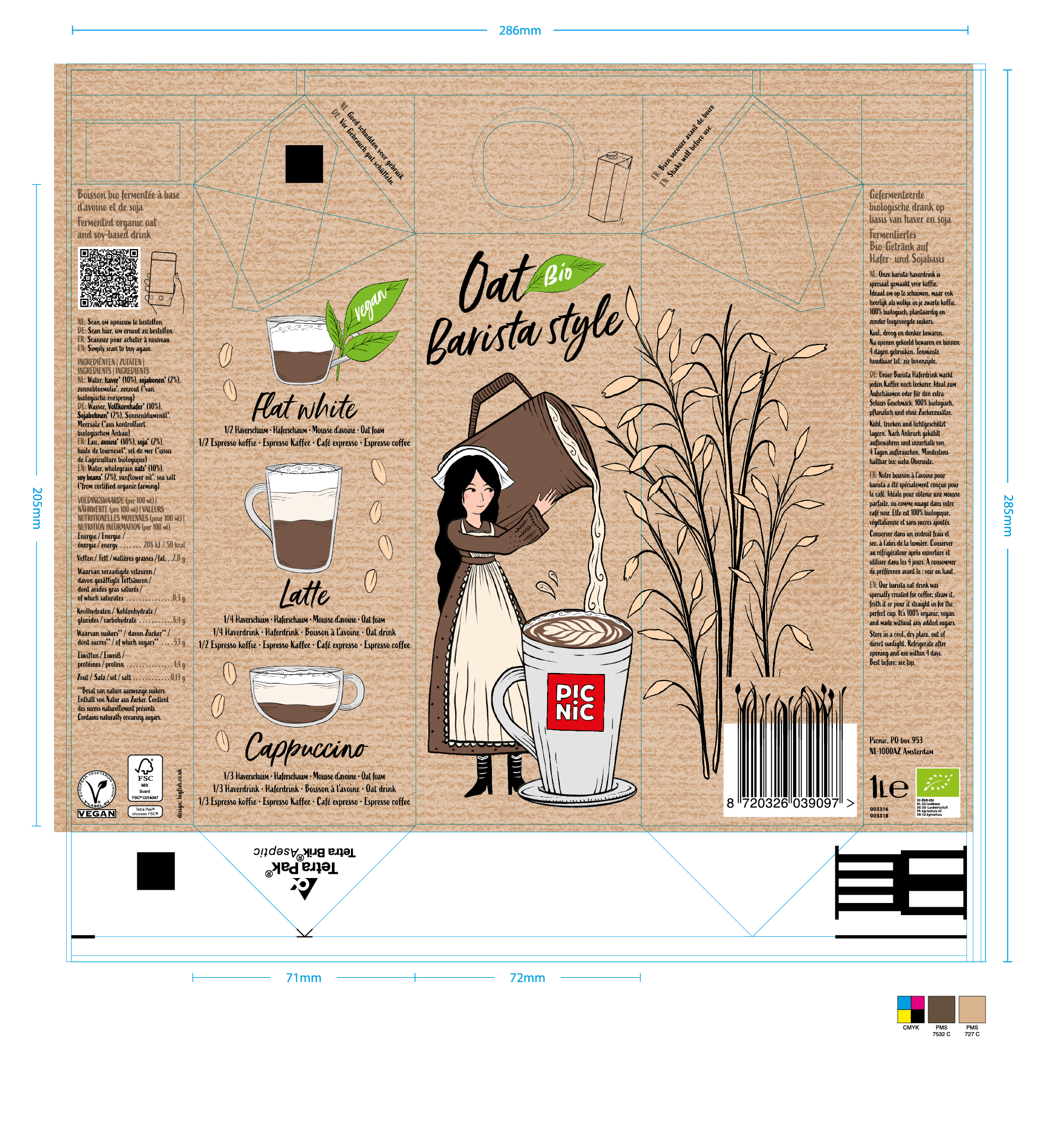
Picnic - Barista Style Oat Milk
The Tetra Pak carton contains an oat milk especially designed for the making of coffee. The carton is printed CMYK with a Pantone 727C background colour and uses Pantone 7352C and Black (K) for the text.
This artwork is very small part of the Picnic own brand project. Due to the quantity and scope of the task I was involved in as the Freelance Production Manager. I had to liaise with the client and printers regularly across the wide range of different packaging and print processes involved.
Picnic are a Dutch Supermarket who are only based online which allows for a different way of looking at FMCG packaging. The emphasis of the designs are to look great when displayed within your cupboard at home instead of fighting for stand out and space on a store shelf.
Scroll down for more

GSK - Aquafresh
This artwork is printed to an aerosol can through the dry offset printing method. It is printed in 5 colours with two white underpinning plates (shown as a light magenta and a light cyan). There is a solid white and a tonal white (for tonal areas) which means it can be adjusted separately on press.
I created print ready artworks for the range ensuring that certain areas were backed with a white plate or tonal white to present as a flat colour, with the rest of the artwork appearing metallic.
Scroll down for more
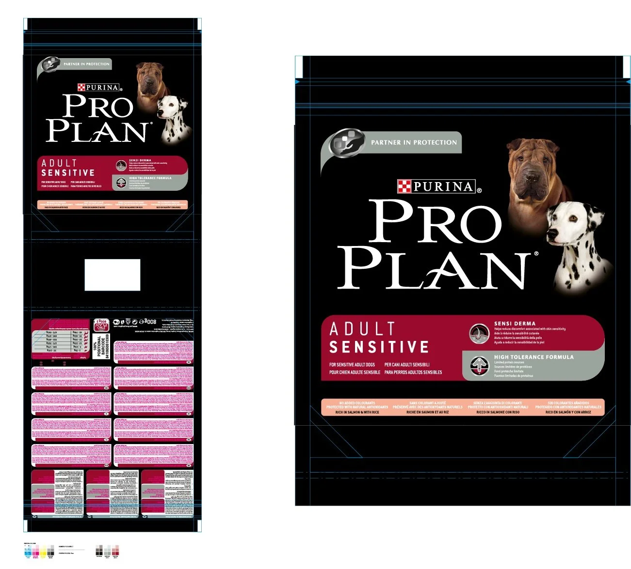
Nestle - Purina Pro Plan
This artwork is one small part of a very large range of pet food I was involved in across a global market.
The range of languages makes the back of pack text very tight but means exactly the same artwork can be used across these regions at reduced cost.
The artworks had a cameo of dogs on each pack (different for each variety) which had to be trimmed out and retouched whilst still making the fur look natural and part of the setting. The artwork is printed in 7 colours in flexo, using CMYK, Rich Black (BG), Pantone 444C and Pantone 202C.
The magenta text is purely to highlight the languages that need to be replaced at repro.
Scroll down for more

Yeo Valley - Greek Style Yogurt
This artwork was an update to one of the Greek Style range of yogurt’s from Yeo Valley.
The honeycomb and the bees had already been illustrated. I put these elements together with the background creating a composition that would fit the format of the cutter. From there I built the artwork ensuring the correct BOP icons were used according to their guidelines and FIR legal standards were adhered to.
The sleeve was printed in 7 colours using CMYK, Pantone Cool Gray 8C, Warm Gray 11C and Pantone 717C.
Scroll down for more
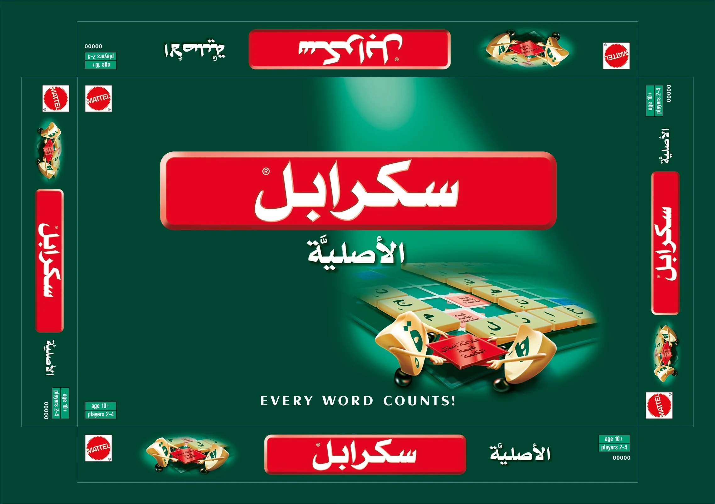
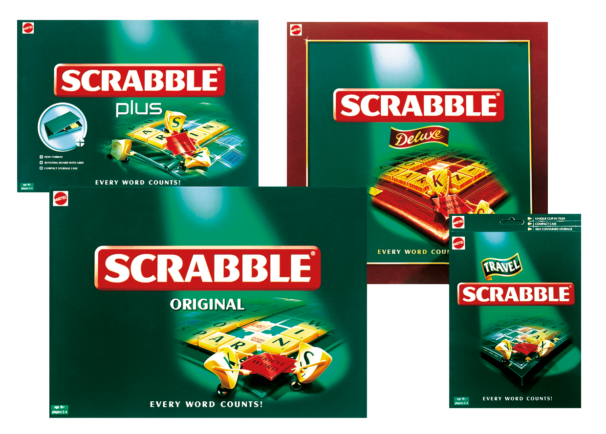
Mattel - Scrabble Global redesign 2000
The Scrabble redesign was produced for the global market and was introduced to inject more fun into the brand, this was achieved
with the Scrabble tile characters. The design was applied to several different SKUs including “Travel”, “Deluxe”, “Original” and “Plus”
(produced for airport sales). There were also life stage designs created including “My First” and “Junior”.
Every different language artwork required new tile illustrations which I created in production for the front and sides of pack. Arabic Scrabble shown left was a complete reverse as the language reads from right to left making this the trickiest to implement.
Scroll down for more

Diageo - Rosebank 25 YO Scotch Whisky
Shown here is the body and foot label artworks for a rare triple distilled Whisky called Rosebank. The labels had to have a premium feel to emulate the quality of the product.
My involvement was to create final and mock-up artworks. I liaised with LNS (wet proofing & mock-up supplier) to ensure the client was happy with the design and substrates, prior to the final print run.
The label is printed in three colours (Black, Pantone 871 and Pantone Cool Grey 9) on a Strathmore Writing Natural White Wove substrate. The magenta shown here denotes the areas to be embossed.
The “flower” itself was created from a supplied woodcut illustration.
Scroll down for more

William Grant - Glenfiddich 40 YO Scotch Whisky
Being a 40 year old Whisky the label had to look very premium hence using a high gloss metallic substrate and a special mix copper ink to achieve this.
I had to ensure the Glenfiddich Beast, logo type, text and flourish were all reversed out of the copper to appear silver as the substrate.
A printed black was used to emphasise the embossing with emulated shadows. An emboss profile was supplied to highlight the shape of the tooling required.
The finishes are shown as a grey stipple in the background being the deboss which created a textured area as shown in the photograph. The magenta areas highlight where the embossing sat.
Scroll down for more

AB InBev - Becks Vier
I really enjoyed working on the Becks Vier project which encompassed both the can and the bottle and all the other various SKU formats it came in.
For me this project allowed me to visualise and artwork all of the elements from the droplets to the cans and the bottles which
appear on the SRPs. The outer case is printed in Pantone 356C, Pantone 485C, Tonal Black and a Solid Black to allow for some adjustment on press.
Scroll down for more
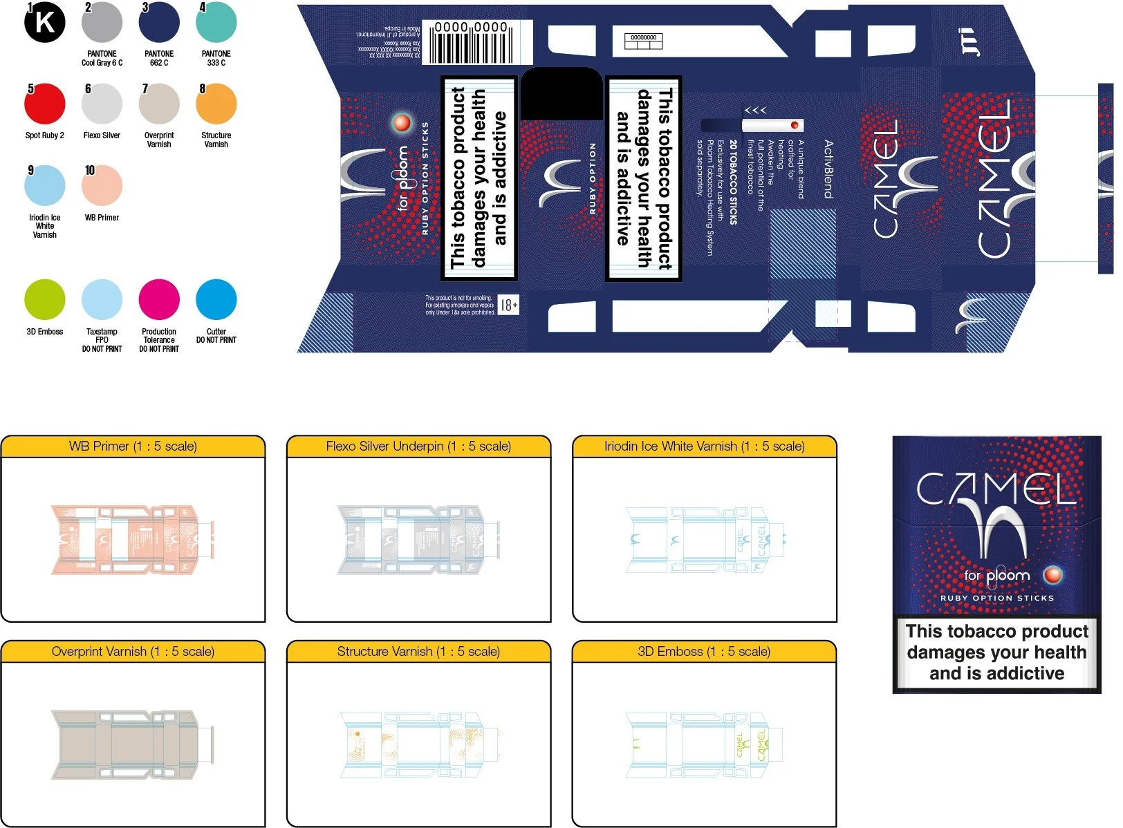
JT International - Camel for Ploom
Shown here is a very small part of a much larger project I was involved in to introduce the Camel brand to the Ploom devices.
My task was to create artworks for different markets (various sized health warnings and legal information) with different flavour variants ranging from fruit through to menthol tastes. Guidelines and visuals were also produced to support this project.
Tobacco usually entails more complex artworks with Pantone (Spot) colours used and a variety of finishes. They can also have many
GMG and wet proofing sessions (including scatterproofs to test what combinations work) to ensure the final designs perform perfectly
together as a range.
I’m usually involved with the creation of said proofing files and liaise with the wet proofers to make any adjustments that may be required.